Certainty
The owner knows how the horse is doing without having to ask. Everything the brand says should add to that feeling.

Sport-horse rearing, boarding and training

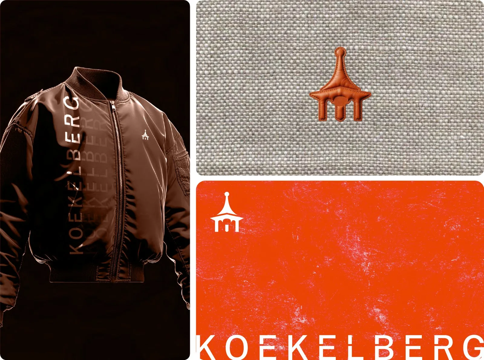
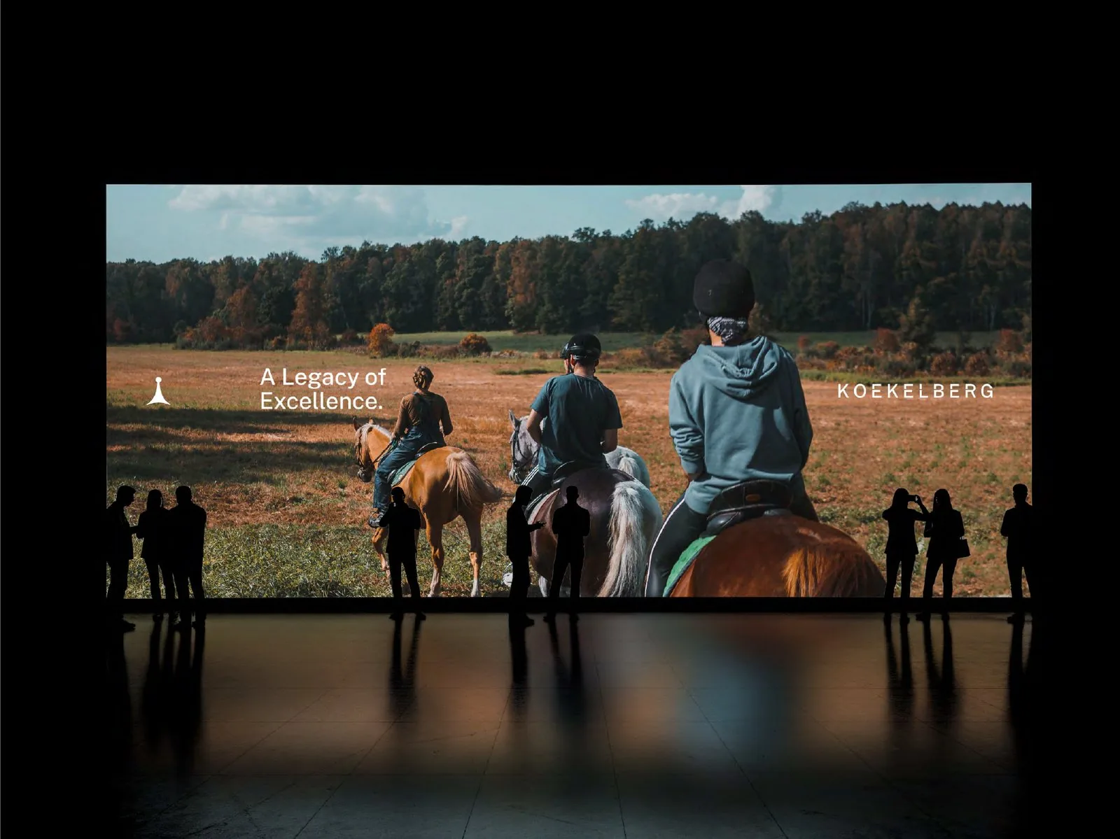
Koekelberg is a premium equestrian brand built on a 17-hectare estate in the Netherlands, around a 17th-century Flemish farmhouse. It rears young sport horses, boards them and trains them for performance. Equestrian heritage, careful horsemanship and disciplined training meet in one place.
The owners who send a horse here all carry the same question: is my horse well when I'm not there? Koekelberg answers it with documented work and open communication, every day, so the owner never has to wonder.
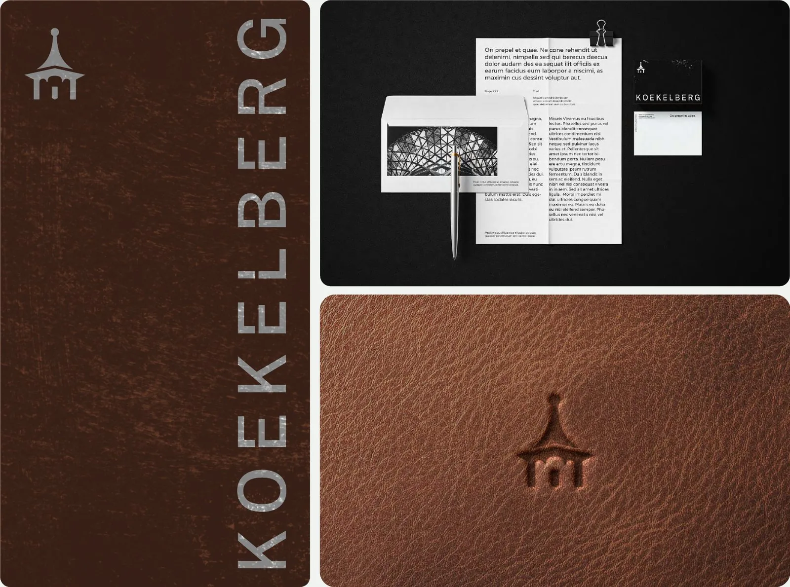
The identity says this quietly. A tracked uppercase wordmark with small cuts in the letters, like a stencil on a stable door. A spire taken from the estate's roofline, and a bell turret that once called the workers in from the fields. Saddle brown, black and stone, with one signal orange for the thing that matters most.

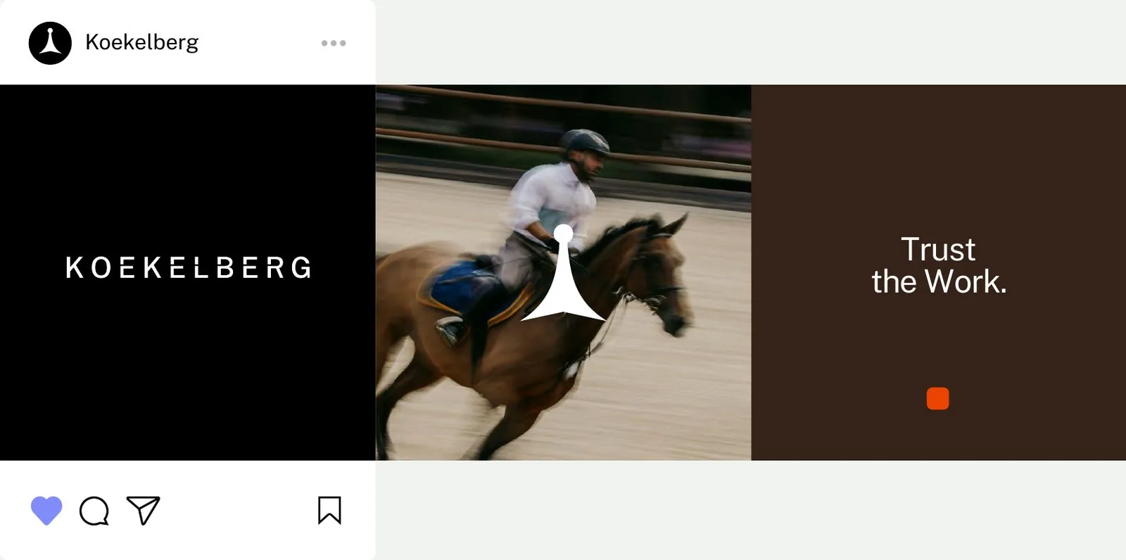
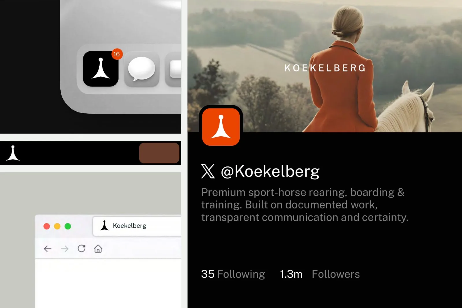
The owner knows how the horse is doing without having to ask. Everything the brand says should add to that feeling.
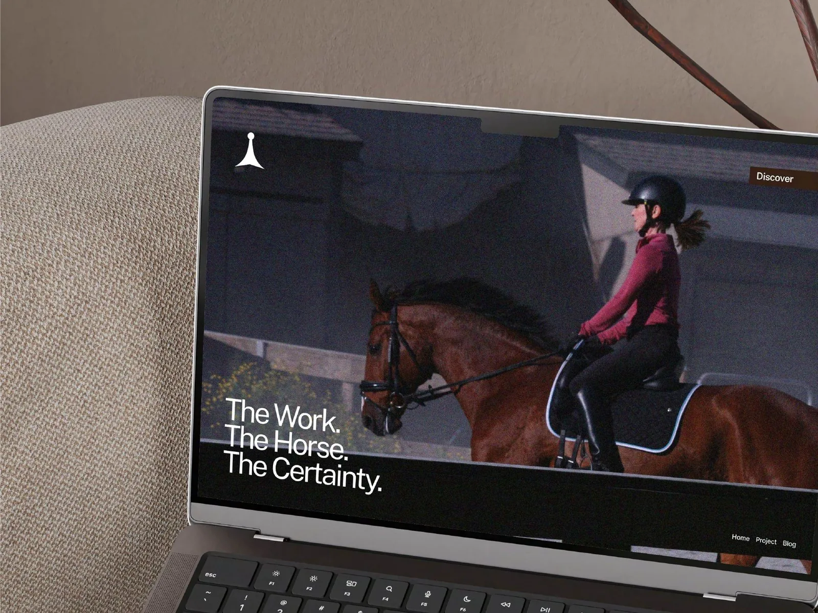
Training is logged and shared. The brand shows the work itself: the arena, the hands, the horse, not a slogan about it.
Plain updates, real photos, nothing staged. If something went wrong, say so.
Owner, rider and stable work as one team for the horse. The brand speaks to owners as equals.
Ready for a rebrand like Koekelberg?
book a call